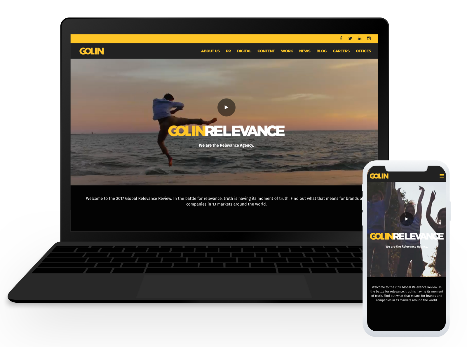
GOLIN
Golin is a global digital content, marketing and PR firm
︎ I’ve been working with them for a while now, and our team was offered the opportunity to redesign the global website
Client: Golin
Platform: Responsive website
Duration: 2 Months
Role: Researcher, Strategist, Information Architect, UX Designer and Visual Designer
Methods: User Research, Sketching/Wireframes, Usability Testing and Prototyping
Tools: Sketch, Whiteboard, Pen and Paper, Invision
Team: 5 (Interaction Designer, Project Manager, 2 Back-End Developers, UX/UI Designer)

THE PROCESS
︎ Discover
︎ Discover
︎ Ideate & Design
︎ Test & Iterate
︎ Build & Deliver
︎
Pain Points
- Miscommunications
- Very short turn around
︎ Goals
- Create a fresh new website for their relaunch
- Deliver clear, and concise messaging about the company
- Increase conversion for the Golin Agency
- Make the mobile and desktop user experience as seamless as possible
︎ Opportunities
- Create a responsive, accessible solution
- Design modular components usable within a wordpress template
IDEATE & DESIGN
Methods & Tools
Sketching, Whiteboard, Prioritization Matrix, Site Maps
Sketching, Whiteboard, Prioritization Matrix, Site Maps
Challenges
- Creating an intuitive sitemap for an easy navigation throughout the website
- Developing a modular block system without having the final assets and messaging
- Breaking down all the content on the website to understand what are the chore values and messaging
Prioritization
- Developing a practical information architecture
- Creating adaptable blocks. The goal of this project is to design mutliple wordpress modules that can be implemented for different use cases (a block that can be used for case studies as well as blog articles for example)
- Being mindful of how each module will stack on mobile

